Microsoft’s Visual Overhaul: A Sign of Broader Innovation and Industry Shake-up
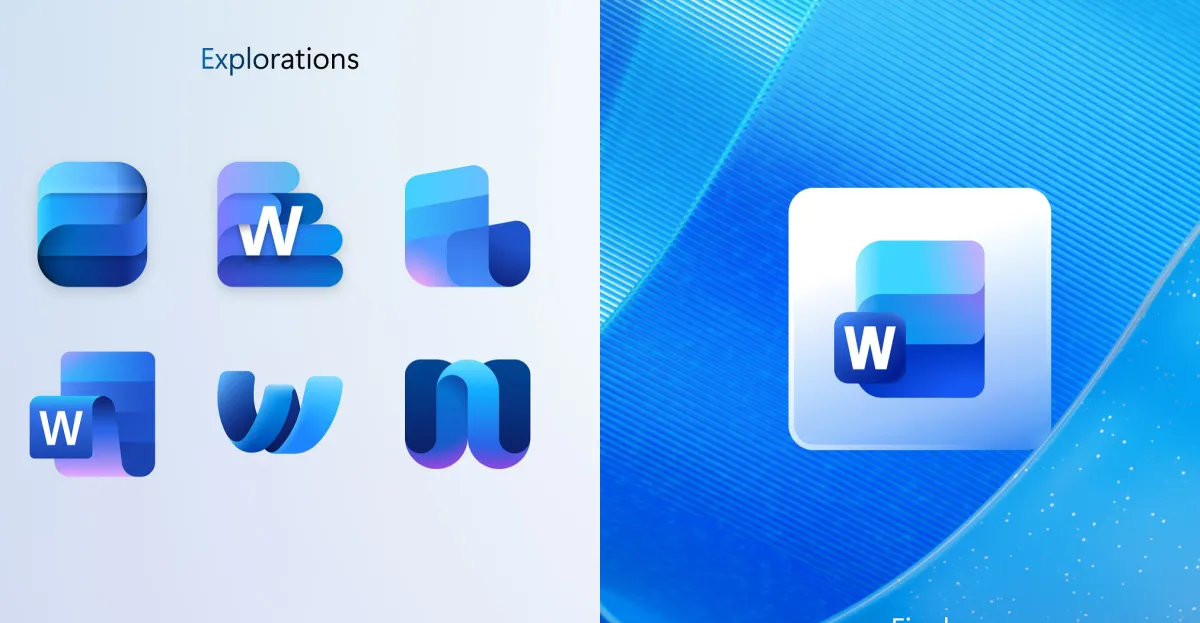
Microsoft has recently launched a refreshed set of Office icons, embracing a more modern, colorful, and flexible design language. This move is more than mere aesthetics; it reflects the company’s strategic pivot towards enhanced user experience, digital branding consistency, and a broader push for design-driven innovation within the enterprise software sector. By publicly sharing early design concepts, including radically different directions for Word, Excel, and PowerPoint, Microsoft signals its intent to stay ahead of the curve and adapt to the shifting expectations of a digital-first, youthful audience.
Disruption Through Design: A New Standard for Tech Giants
This icon refresh is emblematic of a larger trend among major technology firms embracing disruption through visual and UX innovation. According to industry analysts from Gartner and MIT’s Media Lab, visual identity updates often precede major product and process transformations, serving as a signaling mechanism for future capabilities. Microsoft’s initiative to experiment with different design concepts—some reminiscent of older Mac icons—indicates a deliberate strategy to balance nostalgia with innovation, and demonstrates how usability and brand coherence are now central to enterprise technology’s competitive edge.
- Enhanced clarity and simplicity for intuitive user interaction
- Better cross-platform consistency across Windows and iOS
- Fostering a more youthful, dynamic brand image to appeal to next-gen users
Critics and design experts note that such visual reinventions are crucial for maintaining relevance in an evolving tech landscape. As Elon Musk emphasized in recent Tesla updates, disruption often begins with a fundamental shift in perception—what users see and feel. Microsoft’s latest move echoes a broader industry paradigm shift, positioning it as a bold innovator rather than a reactive player.
Business Implications and Future Outlook
The rollout of these redesigned icons, especially on platforms like Windows and iOS, demonstrates Microsoft’s commitment to a cohesive, future-proof ecosystem. This approach could serve as a template for other tech behemoths seeking to redefine their brand identity amidst stiff competition from startups and new entrants leveraging faster innovation cycles. Additionally, the strategic alignment with cloud-based collaboration tools—such as Teams, OneDrive, and Outlook—suggests that Microsoft sees visual coherence as integral to fostering higher user engagement and productivity.
Given the rapid pace of technological evolution, it is imperative for industry leaders and investors to monitor how such visual and UX innovations influence adoption patterns and productivity metrics. Disruption is no longer confined to functionality alone but extends deeply into perceptual and branding domains, inevitably impacting market share and long-term viability. As Peter Thiel and other thought leaders warn, complacency in innovation can soon become an existential threat in this hyper-competitive digital arena.
Looking ahead, the next few years promise intensified experimentation as companies seek to balance cutting-edge innovation with user-centric design. Microsoft’s visual metamorphosis signals a broader evolutionary phase, where visual and functional innovation intertwine to forge new standards of industry disruption. At a moment when the tech landscape is more competitive than ever, those who innovate rapidly and authentically will shape the future of work, communication, and enterprise technology—making the urgency for strategic, disruptive leadership unmistakably clear.